Beginnings
Mark+Fold began in 2015, with a quest to create the perfect notebook. Once we had worked out all the important functional details like paper choice and binding, it was time for finishing touches. We wanted to add some subtle adornment to the book without it feeling superfluous or distracting; it needed to feel neutral enough for the book to 'belong' to anyone.
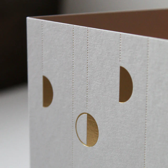
We were reminded of the thumbcuts in old phonebooks and dictionaries. Conventionally, these served to help you find the 'p' section in a dictionary, but for me as a child it always felt like a tactile invitation to 'turn the page' and interact with these pages. All of that felt right — the front cover of a notebook should 'invite' you inside.

Initially we wanted to try an actual cut-out, but even our expert bindery in the Netherlands couldn't do this for us and so they sent samples off to Germany to another specialist. We were unsure if the cut-out would be impractical, as it might snag or become dog-eared with use. So when those samples got lost in transit, we decided to take as a sign and take a different route! We decided instead to imply the thumbcut via another method — hot foiling.


Iterations
The thumbcut has appeared on every edition of the Mark+Fold Diary and notebooks since 2015. When you see it on a shelf you recognise it's a Mark+Fold, without having to see a logo or anything too obvious. To begin with it was always gold (not just any gold of course, we selected a very warm muted gold, not too yellow, with a luxurious matt finish). Later we dabbled with black on earthy shades like rust and mustard. Then we tried neon on natural tones like our beloved off-white ‘mist.’


Over the years we've also played around with it a bit. In 2020 we used the semi-circle shape to create giant half circles that read as the '0' in 2020.

That year we also added our Brass Page Markers to the collection. One of our designers was travelling abroad and spotted these in a stationery shop. She texted me ‘Look! It’s the semi-circle!’ And so we started stocking them from then on.

In 2021 we created a Christmas Card design with delicate circles and half-circles made up of the Mark+Fold thumbcut, dangling from impossible dotted strings.

And in 2023 we created a playful ‘8’ made up of 4 thumbcut semi-circles. This one existed in our heads for a while and we weren’t sure if it would work visually. But it actually came out delightfully well, so we had some postcards printed to go out with customer orders in the month following our 8th birthday. You can see an animated version here on instagram.

—
Enjoyed this article? Join our mailing list to receive stationery joy like this straight to your inbox (plus a £5 Gift Card when you sign up).
Leave a comment: